Why a Club Badge Has to Work at Every Size
Why a club badge has to work at every size: learn how shape, lettering and detail keep a club identity recognisable on scarves, signs and screens.
How can a club badge stay recognisable when it is stitched on a scarf, painted on a ground sign or reduced to a tiny image on a phone? The answer is not to preserve every detail at every scale. A successful club badge relies on a clear silhouette and a small number of visual clues that remain distinct when the design is reproduced in different materials and sizes.
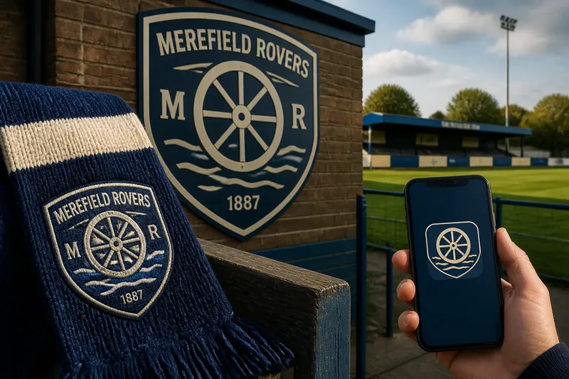
Consider a clearly invented situation. Merefield Rovers, a fictional community club, has a badge showing a river, a mill wheel, a ball, the club’s initials and its founding year inside a detailed shield. It looks handsome on a full-size poster, but the initials merge on a scarf and the river becomes a dark patch on the club’s fixture app. The committee wants to keep the story behind the badge while making it work in all three places.
The solution begins not with a new drawing, but with deciding what people should recognise first. That distinction matters: a badge is both a small graphic and a container for a club’s identity. It cannot communicate every part of that identity equally well at every size.
Begin with the badge’s strongest recognition cues
A recognition cue is a feature that helps someone identify a badge without reading all its wording. It might be the outline, a bold central symbol, a distinctive division of colours or a particular arrangement of shapes. For Merefield, the mill wheel is more useful than the founding year because it can be recognised as a form, even when the lettering is too small to read.
The committee asks people who already know the club what they picture when they hear its name. Their answers point to the wheel and the dark blue-and-cream shield. Those become the primary cues. The river, initials and year still matter, but they have different jobs: they can provide detail on a larger version without carrying the burden of identification on a small one.
This is a useful distinction for any club. Identity includes history, place and membership; a badge is a compact visual expression of that identity. Trying to fit the whole story into one mark can make its most recognisable parts harder to see. Keeping a story in the club’s words, displays and traditions does not require every detail to appear in the smallest badge.
Use a silhouette that survives the first reduction
The silhouette is the badge’s outer shape and the broad arrangement inside it. If the design is reduced until its wording is unreadable, the outline should still feel deliberate rather than collapsing into an indistinct blob. A shield with a clear upper edge and tapered base may do this better than a complicated border of thin curls and notches.
Merefield’s designers simplify the shield’s perimeter and give the wheel a larger, uncluttered space at its centre. They keep the river as one broad curve instead of several narrow parallel lines. This is not merely cosmetic editing. Small gaps and fine strokes can close up when thread, paint or a low-resolution screen reproduces them, so the basic shapes need enough separation to remain visible.
Negative space—the open area around and between shapes—helps preserve that separation. If the wheel’s spokes crowd the river or touch the shield’s edge, the elements can merge visually. A little breathing room makes each form easier to distinguish, particularly when the badge is viewed briefly on a scrolling screen or from across a clubhouse entrance.
Choose details according to where they will appear
Different uses place different demands on the same artwork. Embroidery has to translate shapes into stitches; a sign may be seen from a distance or in changing light; a phone display may show the badge at a very small size. A design that reads well as a large, crisp image does not automatically remain legible when its lines are stitched, printed or compressed.
For the scarf, Merefield makes the wheel’s spokes thicker and removes the tiny river ripples. The initials are set in plain, sturdy lettering rather than a narrow decorative style. On a ground sign, the full badge can retain a finer river line because viewers see it at a larger scale. On the fixture app, the club uses a simplified mark: shield, wheel and colours, with no small lettering.
That small-screen version is not a rival badge. It is a compact adaptation of the same identity. The central shapes and colour relationship stay consistent, while details that would become visual noise are omitted. A club can use a full crest for formal contexts and a reduced emblem where space is tight, provided the family resemblance is unmistakable.
Keep lettering and colour working together
Words can identify a club directly, but only if the type remains readable. Initials pressed into a narrow ribbon may look balanced in a large drawing yet become cramped when scaled down. Merefield tests a simpler arrangement: the club name on the wider upper band for larger uses, and no wording in the smallest app icon. The wheel carries recognition there; the app’s surrounding context supplies the club name.
Colour also helps recognition, but it should not be the only thing doing the work. A badge may appear on a monochrome notice, a dark fabric, a faded sign or a screen with limited contrast. The main forms should still be distinguishable through shape and spacing. For Merefield, the cream wheel remains separated from the blue field by a clear outline, so the symbol does not depend solely on the contrast between two colours.
This does not mean every badge must be designed for every imaginable condition. It means the club should know its likely uses and identify the situations where a simplified or single-colour version is needed. The material, production process and display setting all affect the result. For embroidery, printing and signage, the club should follow the supplier’s artwork requirements and check any limits with the maker before approving production.
Check the badge in the places supporters will see it
Merefield prepares a small set of practical proofs rather than judging the badge only on a design screen. The proofs show the full crest and reduced mark on a scarf mock-up, a proposed entrance sign and a phone-sized fixture tile. The committee looks for specific problems: closed gaps, unreadable letters, weak contrast and details that disappear or turn into specks.
They also compare the badge at ordinary viewing distances. A scarf is often seen close up, but its design is recognised at a glance across a room; a sign may be read while someone approaches it; an app icon has little room for a caption. The point is not to make each setting identical. It is to see whether the intended recognition cue survives in the setting where it needs to do its work.
Imagine a different invented club, Bracken Vale Athletic, whose crest contains a tree, a bridge and a long club name. If the tree’s branching lines vanish on a sleeve patch, the club could preserve the tree’s broad crown and trunk while dropping the smallest branches from that version. If the club name then becomes a dark strip, it could use the full wording on a sign and a simpler emblem for the patch. The expected observable result is a patch where the tree remains identifiable without pretending that its tiny lettering can be read.
What should a club ask before approving a badge?
Which part should people recognise first?
Choose one or two cues, such as a distinctive outline, central symbol or colour arrangement. If several elements compete for attention, simplify the smallest version until the intended cue is clear.
Does the outline still read without the wording?
View the design small enough that the lettering cannot be read, then check whether its broad shape and central forms remain distinctive. If not, reconsider the silhouette or the scale of the main symbol.
Which details disappear on the intended material?
Look closely at a supplier’s proof for embroidery, print or signage, paying attention to thin lines, narrow gaps and small letters. Ask for an adjusted version if those features merge or become uneven.
Is a reduced version still recognisably the same badge?
Compare the compact mark with the full crest and check that the shared silhouette, symbol or colour relationship remains consistent. Removing detail is useful when the design’s defining features remain; replacing those features with unrelated ones weakens recognition.
Keep the club’s story without crowding the mark
Merefield’s final decision is to retain the river, initials and founding year on its full crest, while giving the wheel more space and simplifying the shield. Its scarf artwork uses sturdier lines and fewer interior details; the app version keeps the shield and wheel alone. The history has not been discarded. The badge now assigns its details to versions where people can actually see them.
That is the central lesson of the invented case: a club badge does not need to show everything at once. It needs a dependable visual core, with secondary information added where the size and material can support it. When reviewing why a club badge has to work at every size, judge the design by what remains recognisable on the actual scarf, sign or screen—not by how much detail the largest version can hold.
Before a club commits to new artwork, it can ask the people who will use it to look at the same set of proofs: the kit supplier, the person responsible for the ground sign and whoever manages the club’s fixture pages. Their comments can expose different practical issues while keeping one decision in view: which shapes must survive for the badge to feel unmistakably theirs?